The Curation
Passing the Designer’s Test with David & Tara Designs
Read on for words by Tara Castaneda of David and Tara Design.
As interior designers, we spend hours and thousands of dollars to make spaces cohesive and aesthetically pleasing. From the overall vision of an area down to the smallest detail in the moment of a space. We look at lines, textures, shapes, patterns, scale, balance, tones and more. It’s simple to create a space that looks near perfect for a still IG photo, but when you bring humans into that space, it has to function well too. That’s where function has to meet form. One of the hardest things for designers is to maintain the beauty of the space but keep it functional for day to day use for people with active lives.
One of the hardest things for designers is to maintain the beauty of the space but keep it functional for day to day use for people with active lives.
In our designs, we focus heavily on functionality. Heck! We have 3 young children and just had a newborn this January! We also are blessed to have a parent live with us, along with 3 dogs, 2 bunnies, 2 horses, and 6 chickens. In case you missed it, yep— we live in a zoo! So we need simple, clean, structured, organized function….but you would be dead wrong if you thought we would be willing to sacrifice the style of our spaces we work hard to design to achieve that desired and needed function.
Just recently, we had finally finished our kitchen —central loading zone, am I right?— as well as our master bathroom and almost our bedroom — a place that should be tranquil and clean. It became obvious in the kitchen that our junk zone was doubling in size each week and the cords for chargers were out of control. Our nightstands looked like they were about to take off into flight with all of the cords and plugs strewn about on top of them, draped along the sides, and cluttering the floor space. It absolutely killed the aesthetic we were trying to create. Technology had become our biggest eyesores, and my gosh– we just spent so much effort in making these spaces look beautiful and clean! Talk about maddening. We had to find a way to live in these beautiful spaces too.
On the hunt we went to find our solution for replacing unsightly, utilitarian techy chargers so that our spaces could maintain beauty and purpose. It wasn’t long before we found Courant’s chargers- praise!
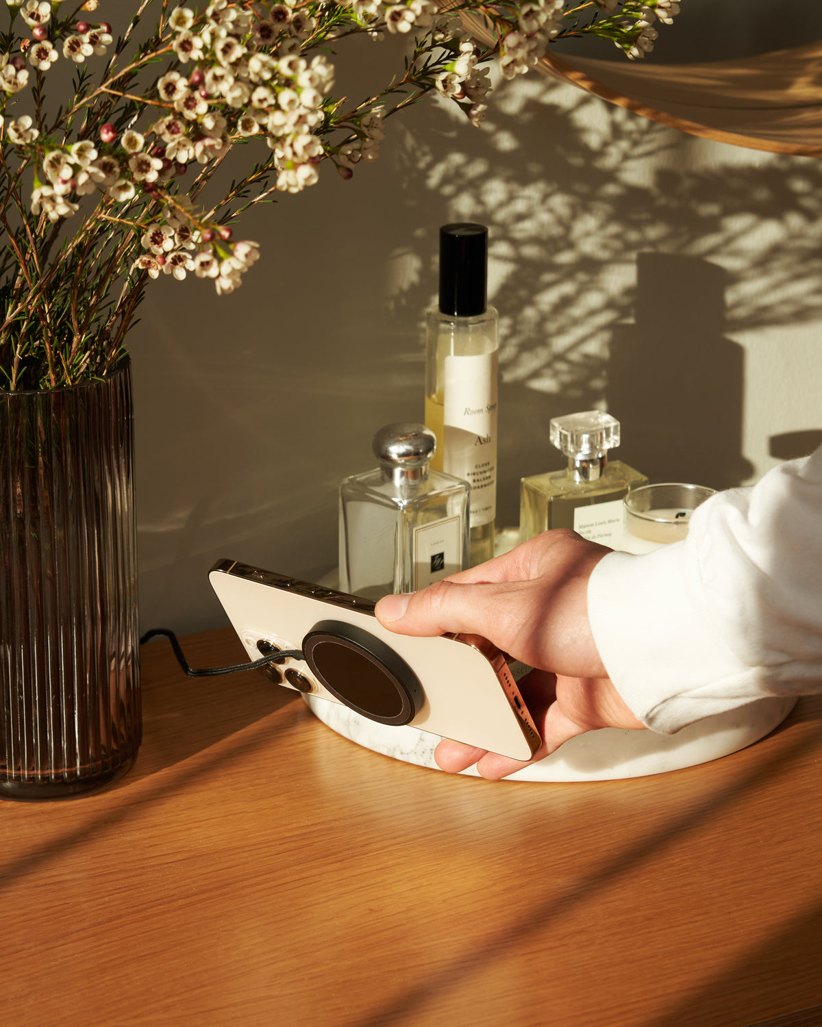
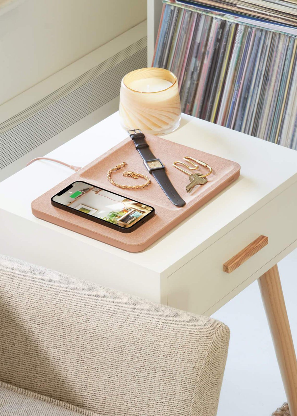
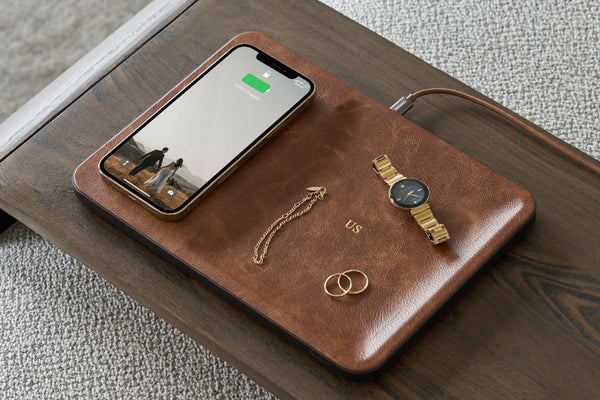
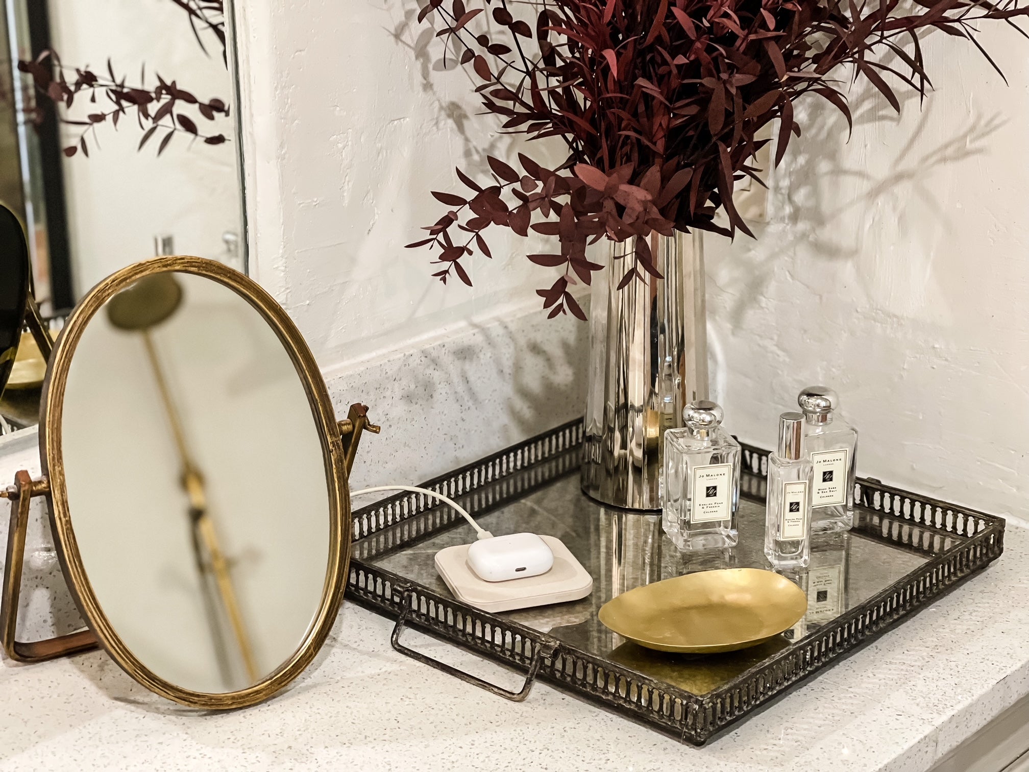
These chargers are crafted with fine linens and genuine Italian leathers, are sleek in their design, serve multiple purposes, and work easily and very effectively. With several color choices and styles available, you are able to intentionally choose a charger for your space so that it serves you and your home best. Whether that is a single charge zone, two charge zones for multiple devices (aka loading zone win right there), or a charging station with a modern looking tray to catch rings, keys, watches, sunnies… this is where Courant really captures the ability to meet your needs but also blend into your home’s aesthetic.
So you guessed it— we loaded up. We got one of each: some in linen and some in leather, all in various colorations to match the look of different rooms where we knew having chargers would serve our family well. Not only do these chargers blend into the spaces seamlessly, but they also complement the spaces well. The charger’s design is one that is modern and aesthetically pleasing so the product itself looks purposefully placed.
But here is one of my favorite unexpected wins with these chargers: they stay put! I don’t know about your house, but there is a living and well phone charger thief that lurks in my home! If it isn’t my eight year old stealing my charger for her iPad, it’s my 4 year old yanking the cord out breaking the end off for her iPad, or it’s my oh so sweet husband “borrowing” my charger for his truck or the shop and it disappears just as fast as it was taken. I cannot tell you how many cords and blocks I have had to stock up on through Amazon that I might as well have set up a monthly subscription. And talk about wasted money and unsightly cords. Ick.
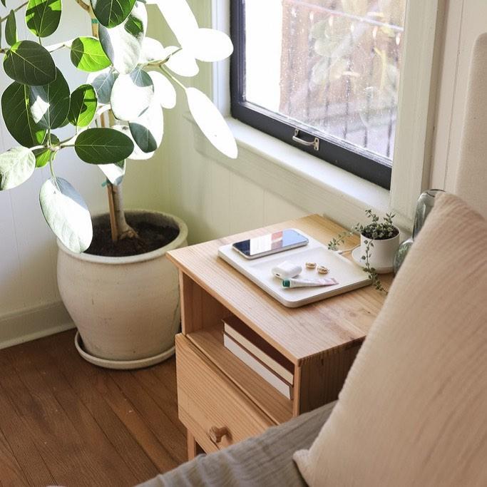
But with Courant chargers, they truly are part of our decor so they aren’t willy-nilly moved around. They are thoughtfully weighted to not slide around and the neutral color choices help them to become part of your interior design. So I know at the end of the day, when I’m ready to retire to the room and recharge my devices from the day, I can expect my clean nightstand to have my oh so pretty charger right there.
I also have a beautiful white linen one on my bathroom vanity that gorgeously blends in my space to charge when I get ready, a handsome cognac leather charging tray to complement the copper tones in my kitchen, and a his and hers double charging station in a tranquil beige tone for our phones and ear buds. As much as you rely on your phones to connect with the world, you might as well have aesthetically pleasing chargers all over your home to simplify your technology needs.
And finally, speaking as a designer, you may have noticed this shift in home design where everything placed in a home should not only have a sense of function, but fit your personal style too. From measuring cups in a kitchen not looking utilitarian but being a striking copper with a dainty handle, to baby gear fitting the color schemes and styles of a home, to even light switch covers going more modern in their design— make no mistake chargers are making their way in design as well. As they should! Courant has hit the nail on the head with their innovative designs, color and textile choices, as well as their top notch technological quality.
It’s the little things, the details, the spaces in between in a designed area that oftentimes make the biggest differences in the beauty of a space. Just as quickly as a bunch of loose ugly gray cords can kill the look of a space, a beautifully designed charger can make a space work.
It’s the little things, the details, the spaces in between in a designed area that oftentimes make the biggest differences in the beauty of a space. Just as quickly as a bunch of loose ugly gray cords can kill the look of a space, a beautifully designed charger can make a space work. And for us, these chargers make our spaces serve us well. You may or may not notice them at first, which is kind of the point. They blend so well and don’t have the look of the outdated chargers. In the end, they just make sense. And they work. And they’re simply beautiful.
Honestly, any way we look at these chargers, they have been a win for us and absolutely, one hundred percent, pass the designers test.
