The Curation
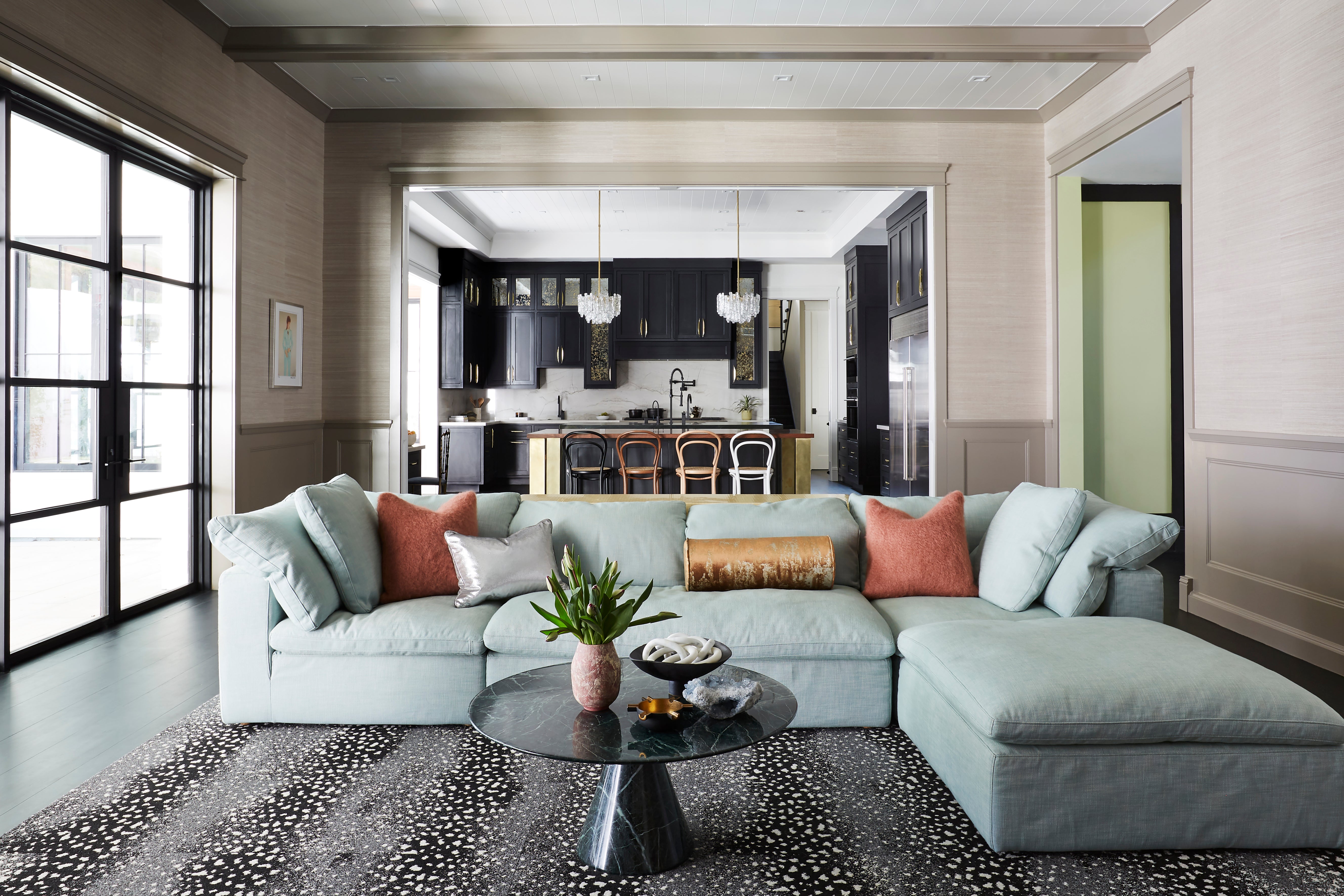
Celebrating Personality with Caitlin Murray, Black Lacquer Designs
We recently sat down (virtually) with the creative mind behind one of our favorite design studios, Caitlin Murray of Black Lacquer Designs. Followers and clients love the Los Angeles-based designer for her organic, and most importantly, fun approach to design — incorporating color, texture and a bit of glamour to bring spaces to life.
Emphasizing approachable luxury, Caitlin’s style focuses on pieces with a beautiful and intentional form — a pillar of our design-forward focus at Courant. Scroll on to read Caitlin’s thoughts on building an individualistic space, even in a work-from-home era.
Tell us a little bit about yourself and your business!
After a few years of working my way through the field, I launched Black Lacquer Design in 2013 as an eclectic, colorful interior design studio with an emphasis on approachable luxury. I’m lucky to be based in Los Angeles where a lot of our clients come from creative industries and are up for pushing boundaries aesthetically. My philosophy is that spaces should be inspiring, dynamic and completely delightful!
My philosophy is that spaces should be inspiring, dynamic and completely delightful!
How would you describe your personal interior design style?
A healthy mix of design styles and eras is so important in order to establish an environment that feels both fresh and timeless. I’m all about mixing unexpected elements; whether that’s pattern, texture, color, shapes, time periods...or all of it at once. I look at projects from the perspective of fine art, where the principles of art and design define both individual aspects of the “piece” as well as the big picture. It’s important to consider how each choice will carry and guide the eye throughout the room, as well as how we, as humans, move through spaces and perceive them. With all of this in mind, I like to develop projects that are curated with many layers, then well-edited to feel both cozy and clean—each with the perfect dose of glamour.

With many people working from home for the first time, what advice would you give to people styling their first at-home office space?
If you can swing it, start at a totally blank canvas and fill in the layers from there. Begin with all essential furniture pieces, like a desk or console table, credenza, chair, etc., then move to any other functional elements like pin boards and electronics. Next, add decorative elements like artwork, textiles and lighting, followed by accessories to round it all out. This way, you clear any clutter from the outset and end up with a well-considered, cohesively decorated and highly functional space.

How do you style your Courant charger?
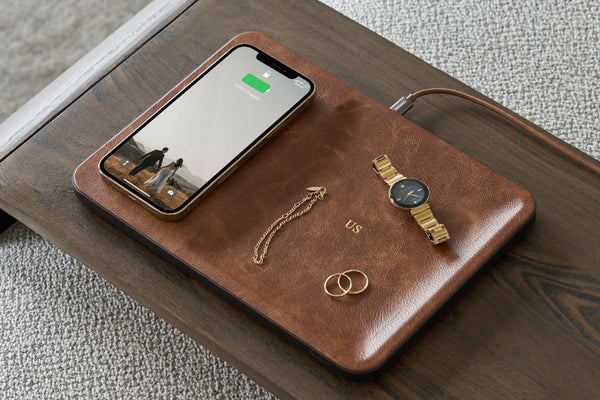
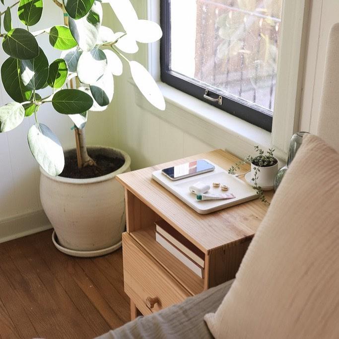
Since my only main devices are my phone and headphones (other than a laptop!), my go-to Courant charger is the CATCH:1. I love the Saddle—it’s so classic and has long been my color preference when it comes to all things leather. I usually have it floating somewhere on my desk (along with about a million tools of the trade) and it manages to look great beside anything and everything. It’s incredibly convenient and visually satisfying to have a pretty landing pad for my phone…especially since I’m on and off of it all day and fishing for the charging cord used to be such a hassle.
It's incredibly convenient and visually satisfying to have a pretty landing pad for my phone... especially since I'm on and off it all day and fishing for the charging cord used to be such a hassle.
What trends are you most excited about?
What I love about interior design in the moment we’re in is that it really feels like anything goes. So many styles are being celebrated and the rules are really relaxed. I relish in the ability to play in that sphere—where clients are up for a range of stylistic directions, from high-gloss lavender ceilings to bathrooms that seem plucked straight out of the 1920s.
Where do you derive your inspiration?
Each project is ultimately inspired by a combination of the clients' personality and the inherent architecture of the space. It may not sound very whimsical, but for me the best way to derive direction is by chipping away at the seemingly infinite options. I don’t like to deviate too far from what speaks to the existing structure and soul of the interior, but the needs and desires of whoever will be inhabiting it is key. For example, if we’re working with people who have a rock-n-roll vibe and a Spanish abode, that already answers the question of where to start (edgy patterns, classic textures and materials but in dramatic or fun colors!). For design to be truly great, it has to work on a lot of levels.

